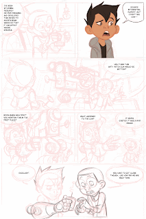


So, now I'm moving on to color. I just start anywhere I feel I can handle. I save the hardest, or least enjoyable parts for last. This way I have enough done to motivate me to finish the page. I went straight from the rough into color for the top right drawing. Next I wanted to do the bottom panel. I fixed the head tilt on the right character and worked him out a little more. I also worked out the glove a little more. I'll go straight to color now. When I clean up, I constantly flip back to the under drawing. Every couple of lines I put down, I check back to make sure it's getting better and not worse. I basically just chisel out the shapes a little more and make sure they are working.

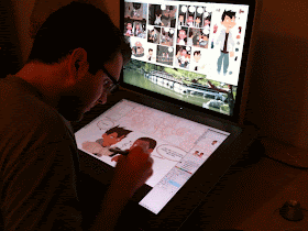
I work in photoshop. I keep what I have finished open on the top monitor so I can refer to it. Also, this story was written by Howard Shum.
i might be a little addicted to your blog(s)
ReplyDeleteThanks Tyson.
ReplyDeleteWow, I've never really thought about spacing that way. And I love the dialogue for that page, haha. Very clever.
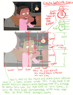
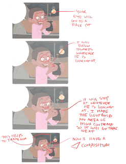
ReplyDeleteWill J: at the studio, that's basically the job of the prop, layout, and character designer. To make sure everything is designed well. If you pause through almost any Disney movie, you'll see shapes broken up into big medium and small and all the spacing will be uneven. Although, occasionally they will do an even background every now and then just to break things up. This story was written by Howard Shum, so I'll let him know you liked it.
ReplyDeletedamn, I want a huge cintiq like yours...
ReplyDeleteHi Rad,
ReplyDeleteThank you so much for this blog, I've been following your other art blog for a while now so it's really exciting seeing such a wealth of information, I'm very inspired! It's understandable too, it's like you're in my head. o_o
Thank you again, I'm grateful!
I dunno anything about comic book making, and it seems out of this world for me. Reading your thought process totally inspiring. THANKS for sharing.
ReplyDeleteI just discovered your blog, it's really interesting!
ReplyDeleteThanks for the advice and congratulation for your work!
Ciao
hey rad quick question-
ReplyDeletewhat are your thoughts on designers like nico marlet? where their style is very flat and graphic, but seems to translate well into 3d?
he seems to approach his drawings purely on "good shapes" like you talked about.
Xav: you should get one.
ReplyDeleteShanna, Ivan: thanks.
Tsunami: Your work is incredible! I wish you had a "How to" blog.
Tyson: Nico is probably my favorite character designer ever. On this blog, I just post about how I do things, I have no clue what Nico thinks about when he draws. But, his drawings are very 3 dimensional, unlike some flatter cartoon network stuff. In the end, you have a flat 2d drawing on paper and you better have some "good shapes" or bad shapes for a good reason.
great response, thanks! :)
ReplyDeleteRad, that's a pretty smart setup, with the monitor as a digital bulletin board for reference. Where is your keyboard, or do you do without hotkeys?
ReplyDeleteeast-eldmam
ReplyDeleteشركة نقل عفش بالدمام
شركة نقل عفش
شركة نقل عفش
google 3280
ReplyDeletegoogle 3281
google 3282
google 3283
google 3284
google 3285
google 3286