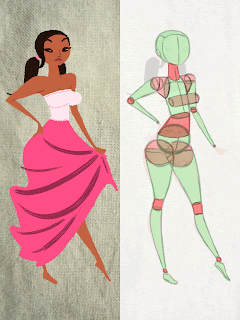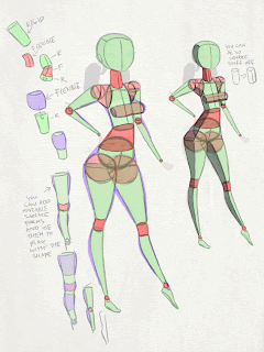

Disclaimer: in no way can you take any of this as the “right” way of doing things. I’m still learning and some of this stuff may even be wrong. I am constantly adapting and changing my approach to drawing. This is just how I think about stuff and I wanted to share it with people. Maybe it can help, maybe not.


awesome breakdown rad
ReplyDeleteI LOVE IT! I CAN'T WAIT TO SEE IF YOU MAKE A PAINTING TUTORIAL...
ReplyDeleteI particularly like how you've constructed the waist and bust
ReplyDeleteThanks for this one Rad..very helpful..I'll try to practice this myself :)
ReplyDeleteThank you Rad, its super clear how you break it down, cheers!
ReplyDeleteHey Rad I was wondering if you had any tips for making color choices and creating appealing combinations? I especially liked the color choices you made for your comic layouts.
ReplyDeleteI always forget about the flexible-rigid-flexible thing. Thanks for the reminder ! ;)
ReplyDeletewow I didn´t see this!! It is great you post the proces! I´m more and more happy!
ReplyDeletegoogle 499
ReplyDeletegoogle 500
google 501
google 502
google 503